MPP Data Portal
A dashboard concept for Meta Managed Partner Program account operations, spend tracking, and reporting workflows.
Context
How can we make this workflow easier to search, track, understand, and act on?
The Problem
- Which accounts belong to which batch?
- Who manages each account?
- Which accounts are prepaid or postpaid?
- How does current spend compare to the previous window?
- Which accounts are growing or declining?
- How do campaign, ad set, and ad-level insights fit together?
Research & Direction
The project moved from workflow research to a fully recreated dashboard UI in one working week, with a mid-process direction shift to a lighter API-to-Excel path.
- Research
Workflow Research
Understood how MPP ad accounts, batches, account managers, spend windows, and reporting needs were being handled.
- Proposal
Wireframe Proposal
Created the initial dashboard concept covering account selection, spend tracking, insights, and admin workflows.
- Stakeholders
Stakeholder Discussions
The marketing team was directly involved in the MPP workflow and connected with Meta stakeholders through recurring weekly meetings.
- Feasibility
Technical Feasibility
Coordinated with the tech team to understand what data could be fetched through API calls.
- Decision
Direction Shift
The team chose a lighter API-to-Excel reporting workflow instead of building the full dashboard UI immediately.
- Recreation
Portfolio UI Recreation
Recreated the original dashboard concept as a high-fidelity UI for portfolio presentation.
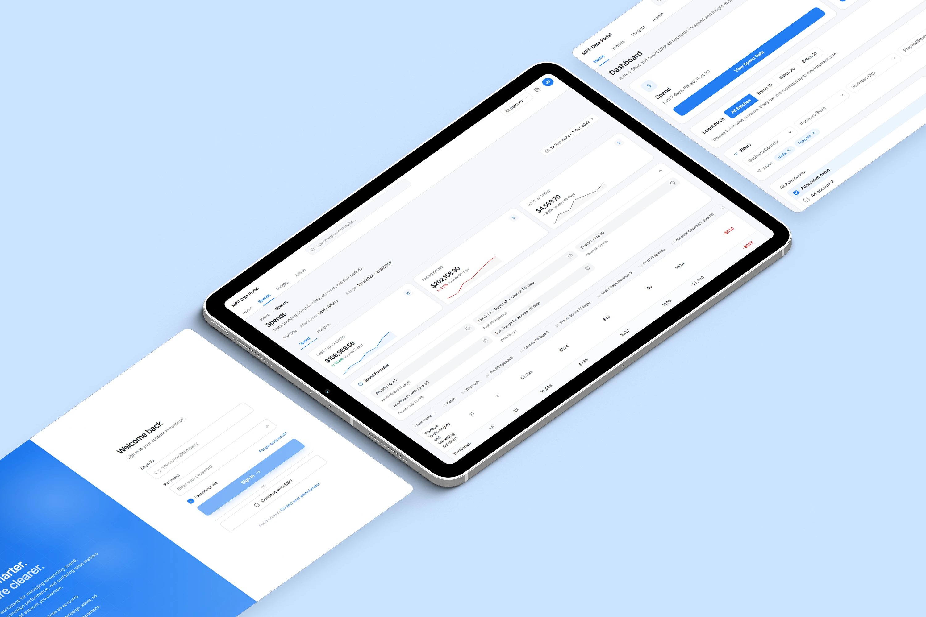
Product Scope
Four connected capabilities formed the dashboard. Together they covered account selection, spend tracking, drill-down insights, and admin maintenance in one workspace.
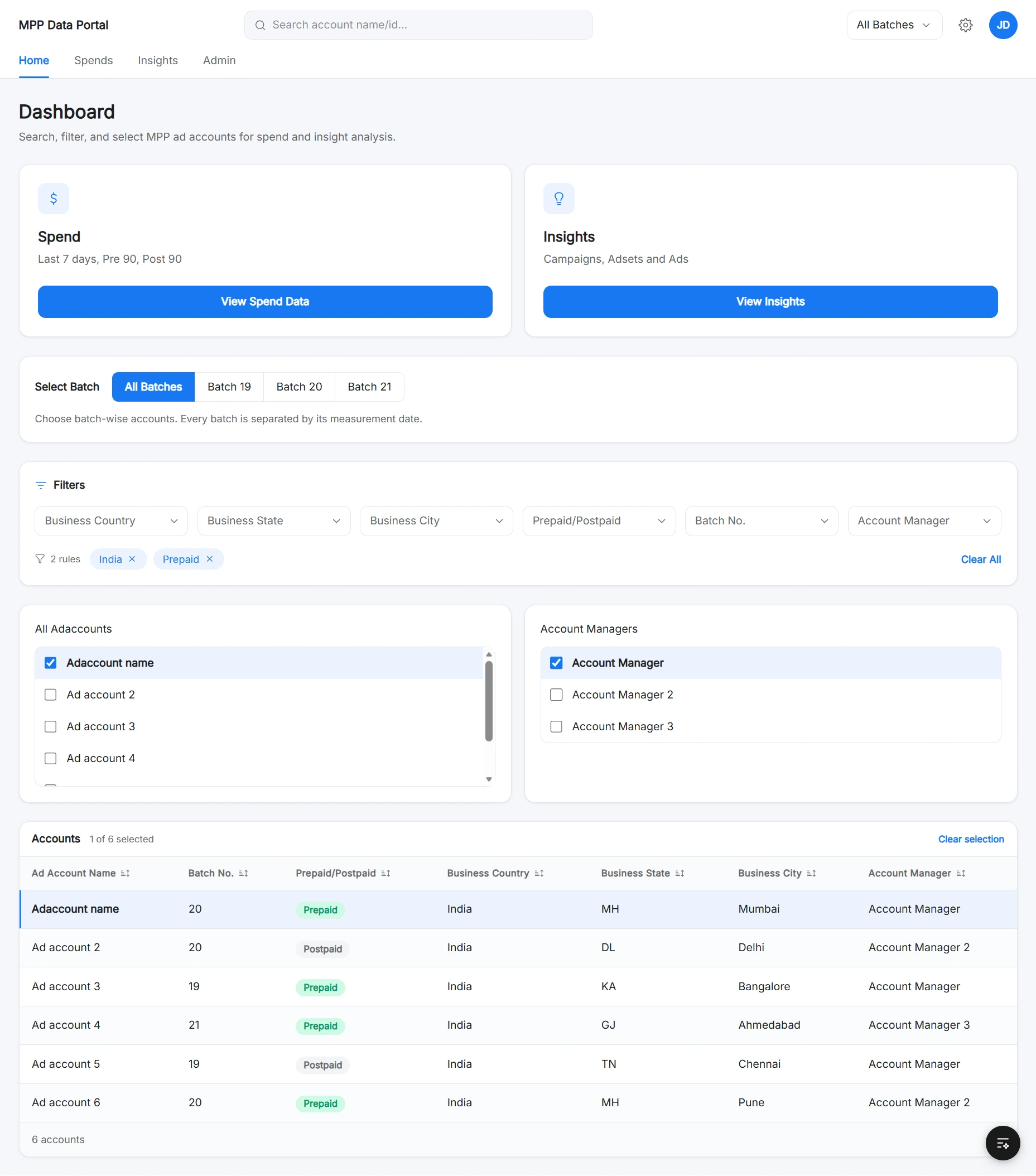
Account Selection
- Search account name or ID
- Batch-wise filtering
- Account manager selection
- Multi-select account controls
Spend Tracking
- Last 7 Days Spend
- Pre 90 and Post 90 windows
- Spends Till Date
- Growth / Decline status
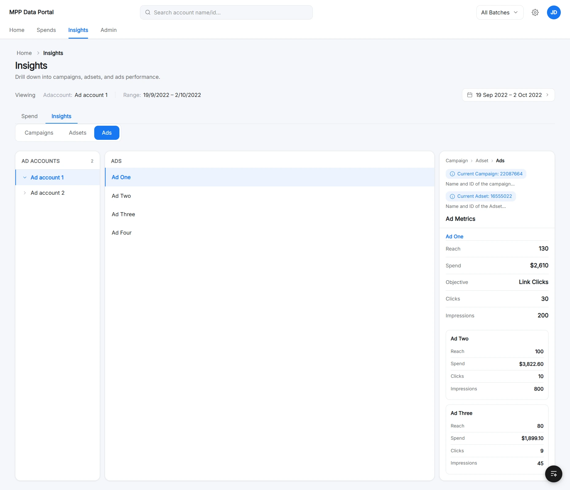
Insight Exploration
- Campaign insights
- Ad set insights
- Ad insights
- Parent-child context
Admin Management
- Assign account manager
- Assign batch number
- Set prepaid or postpaid
- Bulk import accounts
User Flow
Context is established first, then analysis. The admin branch runs in parallel to keep account assignments up to date.
The flow prioritizes context before analysis, so users always know which account set they are reviewing before interpreting spend or insight data.
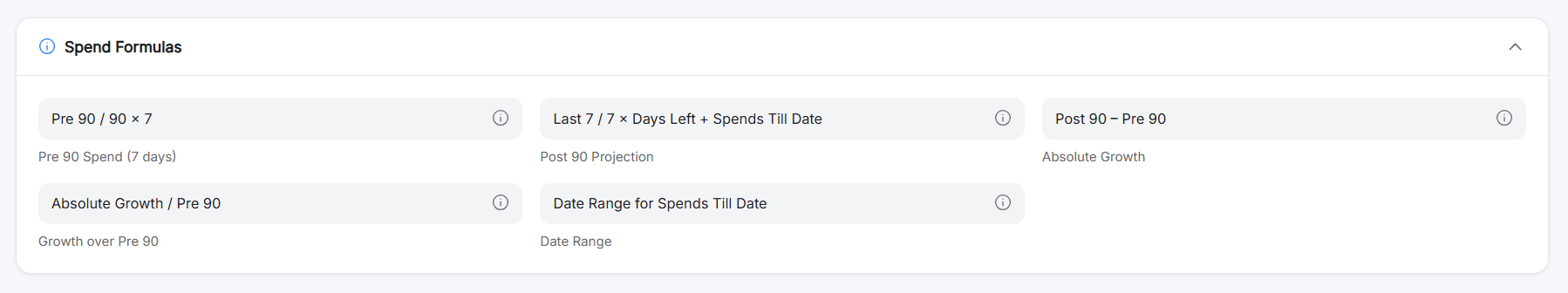
Data Model & Reporting Logic
Design Direction
- Light backgrounds with white cards
- Soft borders and compact filters
- Blue accent states for primary actions
- KPI cards, status badges, and date range controls
- Formula helper panels that made logic visible
- Sortable, exportable tables
Interface Highlights
The recreated interface as one connected system, with callouts mapping each product moment to its supporting surface.
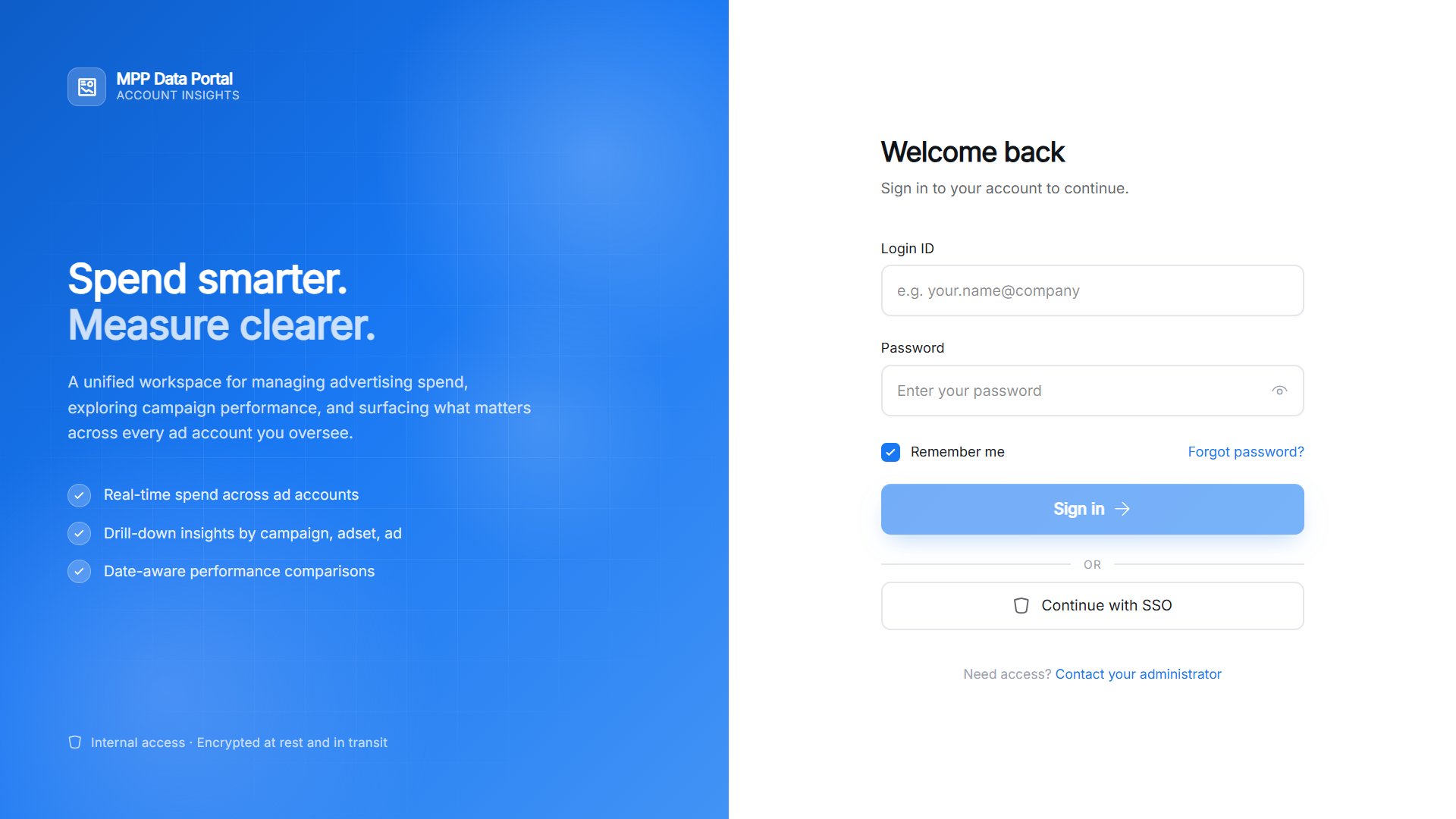

Product identity and access
Login introduces the tool while keeping authentication focused.
Account context
Search, filters, batch selection, and multi-select establish what data is being analyzed.
Spend analysis
KPI cards, formulas, and tables separate summary from detail.
Reporting support
Date range selection, sorting, and CSV export support operational reporting.
Feasibility Decision
Why the Full Dashboard UI Was Not Built
The dashboard concept helped clarify the workflow and data structure, but the team later chose a simpler implementation path to solve the immediate reporting need faster.
Full Dashboard UI
- Centralized account and spend visibility
- Better long-term product experience
- Easier filtering and drill-down insights
- More scalable interface
- Higher engineering effort
- Longer implementation timeline
API-to-Excel Reporting
- Faster to implement
- Lower engineering effort
- Solved the immediate data-access problem
- Tech team handled API-based extraction
- Reports were shared in Excel format over email
What This Project Helped Clarify
The full dashboard UI was not shipped internally. The team moved forward with a simpler API-to-Excel reporting workflow, but the dashboard proposal helped clarify the product opportunity, data structure, and ideal user flow.
Mapped the workflow
Defined how account selection, spend tracking, insights, and admin assignment could work together.
Clarified data requirements
Identified the fields, formulas, reporting windows, and hierarchy needed for the workflow.
Explored feasibility
Coordinated with the tech team around API-based data extraction possibilities.
Recreated the concept
Built a high-fidelity dashboard UI for portfolio presentation based on the original proposal.
This project showed that product design is not always about pushing the most complete interface. Sometimes the best short-term solution is the one that solves the immediate operational problem with less complexity.
Reflection
Other Cases
View more works