Every designer I know has a strong opinion about their primary vector tool. Nobody has a strong opinion about their mockup tool. Because until now, the only real option was Photoshop, and Photoshop was never built for this.
I have been thinking about this specific gap for a while. Carousel content creation is actually a solved problem. Designers move incredibly fast in modern design environments. But the moment you try to present that hard work inside a realistic device frame at the proper platform dimensions, the flow breaks. You find yourself dragged straight back to 2014. You end up dragging static files into messy smart objects and praying the layer orders hold together.
The software for creating content matured. The tools for presenting that content completely stalled out.
MockStep is my attempt to fix that.
It is a browser based mockup generator specifically purpose built for carousel slides. You upload your exported screens, select a format, and output a polished 4x PNG or PDF instantly. There are no heavy templates or weird desktop app dependencies.
Without MockStep
Search for mockup template
Realize the file size is wrong
Boot up Photoshop desktop
Drag individual files into separate smart objects
Mess up the layer masks and restart
~20 minutes. Every single time.
With MockStep
Upload exact screen grabs
Click a staging format
Export your high-res PNG / PDF
Under 2 minutes flat.
Inspiration and Architecture
I wanted to build a presentation staging tool based around how premium interfaces look in reality.
My initial focus centered on researching pure visual patterns. I used Mobbin extensively to find high level structural inspirations. I wanted to break down why certain post layouts felt considered and why others felt incredibly basic. From there I supplemented my research by studying UI workflows on Stitch to see how other creator tools were managing user uploads.
Once the structural and visual concepts were clear, I shifted heavily into execution mode.
I leveraged Antigravity to completely define the backend architecture. This allowed me to map out user data paths and run very quick development loops. Having Antigravity as the technical backbone meant I could easily push code iterations daily and dedicate a massive chunk of time purely to UI and UX polish rather than debugging routing errors all night.
Those combined inputs shaped the layout systems and platform presets you see in the final build.
Decisions
Removing authentication entirely
UX Core Strategy
Consideration
Traditional SaaS patterns dictate building a standard email confirmation loop, password setup, and database matching to capture user leads before they can touch the tool.
Decision
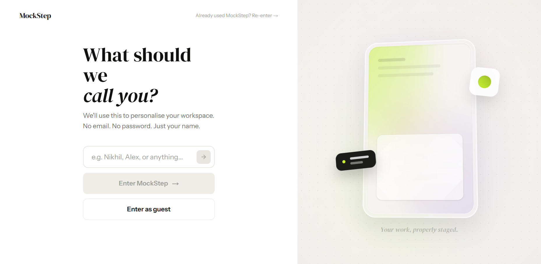
I stripped it down to a single name input relying purely on cached browser storage. MockStep's premise is removing friction from the designer's workflow, so a login gate directly contradicted that philosophy. Users are inside the workspace in seconds.
Cutting 3D compositions before launch
Technical Edit
Consideration
The original scope included heavy CSS transforms to fake complex isometric viewport angles and spatial shadows. It was technically rewarding to build, but visually fell short of high-end physical renders.
Decision
I deleted the entire feature five days before launch. Keeping a flawed rendering system actively damages a tool's credibility. I redirected that timeline into perfecting the eight 2D layout modes, prioritizing flawless execution over a bloated feature set.
Aligning separate code bases
System Polish
Consideration
The marketing homepage and the core editor were built in isolated code environments. Leaving them as-is would mean accepting slight visual drift in padding rules, hex codes, and active button states.
Decision
I paused feature development to run a strict, day-long design system audit. I locked down three exact colors and two font families across both environments, ensuring the transition from the marketing page into the workspace felt like one deeply integrated application.
Building smart router logic
Access Routing
Consideration
Relying on default navigation meant returning users would either land back on a generic hero page meant for new leads, or hit an onboarding screen they had already completed.
Decision
I mapped a lightweight script to check local storage instantly. If your data exists, it seamlessly bypasses the entry gate and drops you directly into your personalized dashboard. Taking twenty minutes to implement this prevented the most annoying UI friction point.
Loading video…
Onboarding
One clean input and one button — no email, no password, no extra friction.
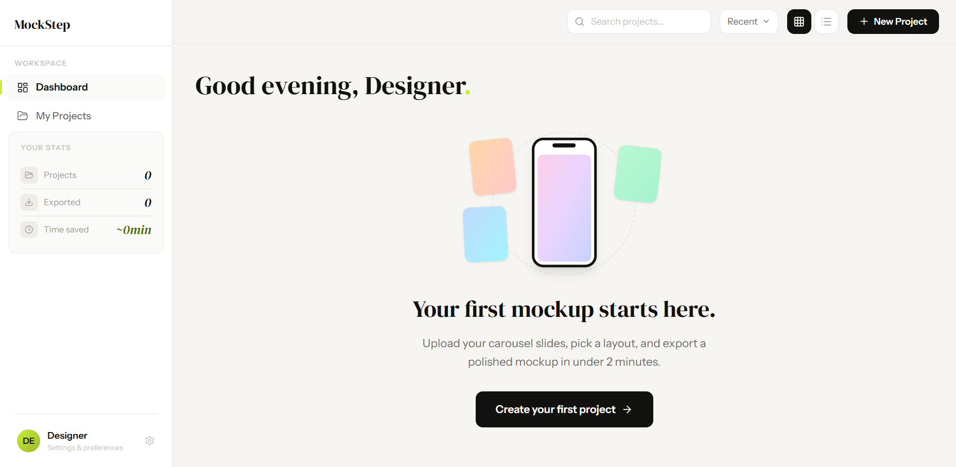
Dashboard
Default platform, layout, and a deliberately lightweight data & privacy layer.
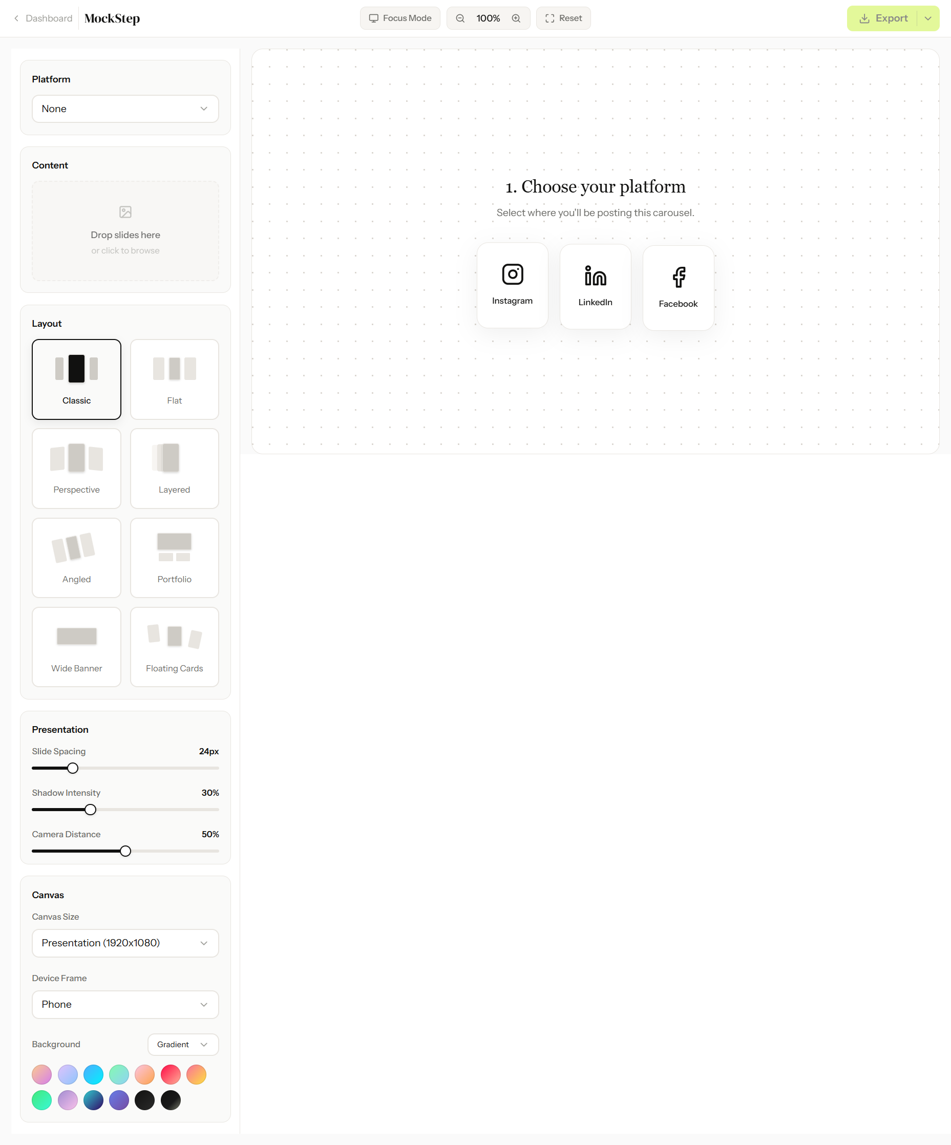
Editor
Eight layout modes, 4x PNG/PDF export, no Photoshop dependency.
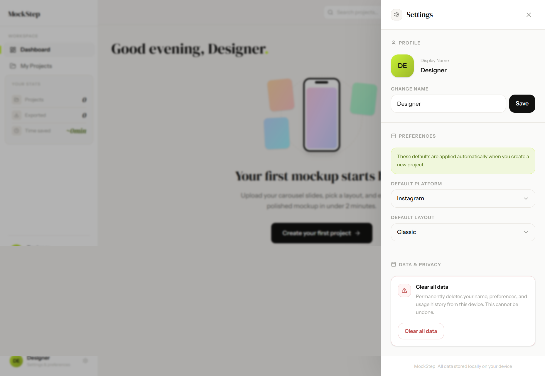
Settings
Scoped everything to two states. Custom folder logic keeps projects organised.
Onboarding
One clean input and one button — no email, no password, no extra friction.
Dashboard
Default platform, layout, and a deliberately lightweight data & privacy layer.
Editor
Eight layout modes, 4x PNG/PDF export, no Photoshop dependency.
Settings
Scoped everything to two states. Custom folder logic keeps projects organised.
The Design System
The visual system is simple: just three colors and two fonts. I locked these down in the first two days because on a tight deadline, you can't afford to waste time second-guessing styling choices.
Lime is the only accent color, and I strictly saved it for primary actions. When you only use a color for main buttons, users instantly know where to click. For the background, I completely avoided pure white. Using a warm off-white reduces eye strain and makes the mockups look like they are resting on a real surface, rather than floating on a blank screen.
For typography, I gave each font a specific job. Instrument Sans handles all the functional UI text so it's easy to read, while DM Serif Display adds some personality to the big headers.
#C8F135
Accent
#F7F5F2
Background
#111110
Ink
DM Serif Display - Display
Your slides deserve a better stage.
Instrument Sans - UI & Body
Upload your slides. Pick a layout. Export a mockup in under 2 minutes.
Outcome
99%
Success Rate
2.4s
Avg Response
<2 mins
Main Action Completion
Reflection
The most useful thing I learned on this project was that it's okay to cut your favorite idea. The 3D layouts just weren't hitting the visual quality I wanted, so I dropped them five days before launch. It reminded me of a core product rule: shipping a few perfect features always builds more trust than shipping a bunch of mediocre ones.
Also, building this with Antigravity completely changed my workflow. Since I didn't have to fight with complex backend or database setups, the gap between designing and building basically disappeared. I got the core mechanics running fast, which gave me the actual time I needed to obsess over the UX transitions and UI polish.